
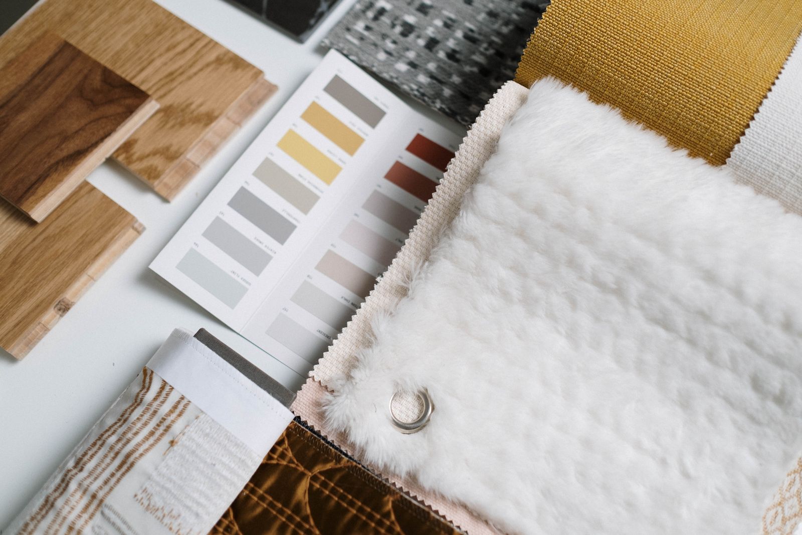
Show finish and material options badly and you don't lose the sale at checkout — you lose it three weeks later, when a buyer opens the crate, sees a walnut that reads gray under their showroom lights, and files a claim. Suppliers who ship a product in multiple fabrics, wood finishes, tile color runs, or countertop materials keep making the same handful of assumptions about variant photos, and each one quietly turns an order into a dispute. Here are the five assumptions that cost the most orders — why they feel true, what actually happens, and what to put on the image instead.
To show finish and material options means giving each variant — every fabric grade, wood stain, tile shade, or stone type a product ships in — its own labeled reference image, so an overseas buyer can tell exactly what they'll receive before ordering, instead of guessing from a name or a single hero shot. That gap between "what the name implied" and "what arrived" is expensive: the National Retail Federation put total U.S. returns at $849.9 billion in 2025, about 15.8% of sales, and "not as described" — wrong color, wrong material, wrong finish — sits near the top of the reason list.
Myth 1: One hero photo covers every finish and material option
Why suppliers believe it. Reshooting a sofa in six fabrics or a cabinet in four stains eats studio time and budget. The product silhouette is identical across variants, so one strong hero shot plus a text list of options feels like enough.
The truth. A buyer choosing "Fabric C, Walnut base" cannot map those words onto a photo of "Fabric A, Oak base." They're not comparing your options — they're extrapolating, and they extrapolate wrong. B2B buyers ordering a container of upholstered chairs won't sign off on a variant they can't see; they either ask for more photos (delaying the deal) or assume the hero shot represents what ships (guaranteeing a dispute).
What works. Give every finish and material option its own frame, shot identically. If budget is tight, shoot the full product once in the best-selling finish, then photograph a labeled swatch or a single component (one chair arm, one door front, one tile) for each remaining variant under the same light. A labeled swatch beats no image, and both beat a text-only option list.
Myth 2: A swatch photo shows the buyer the true color
Why suppliers believe it. You photographed the actual fabric. It looks right on your monitor. So it must look right on theirs.
The truth. It won't, reliably. A screen emits light; a fabric reflects it — two different physical media that no amount of calibration fully reconciles. On top of that, colors shift under different light sources, an effect color scientists call metamerism: two samples that match under your studio lights can look clearly different under the buyer's daylight or fluorescent showroom. Per Datacolor's color-science explainer, whites, grays, beiges, and blacks are the most prone to this "metameric failure" — which is exactly the palette furniture and building-materials suppliers live in.
What works. Stop treating one swatch image as a color promise. Do three things instead: show the finish in context on the real product, not just a flat chip; label the material and its finish sheen in words (matte / satin / semi-gloss / gloss) so the buyer has a spec, not just a pixel; and state plainly that on-screen color is a guide and physical samples are available. Honesty here prevents the "it looked different online" return, which one 2025 study (Salsify) tied to 71% of shoppers returning an item for inaccurate product content.
Myth 3: You can shoot each variant whenever it's convenient
Why suppliers believe it. Variants get added over months — a new fabric here, a new stain there — so each one gets photographed whenever it lands, with whatever lighting the studio has that day.
The truth. The most common reason a variant set looks inconsistent is that the variants were shot in separate sessions under separate lighting. The buyer then reads the lighting difference as a product difference: "Why is the beige warmer than the gray? Are these even the same collection?" You've manufactured a color question that doesn't exist in the real product.
What works. Shoot the whole variant family as one set — same camera position, same lights, same white balance, same crop, same background. When you must add a variant later, match the original setup exactly and drop the new frame into the same grid. Consistency across the set is what lets a buyer actually compare options instead of second-guessing them. The same discipline that keeps product photo callouts legible across a listing keeps a variant grid trustworthy.
Myth 4: The variant name is enough — "walnut," "matte black," "Grade A"
Why suppliers believe it. The name is on the spec line. Anyone in the trade knows what walnut looks like.
The truth. Names are slippery, and the buyer on the other end of an RFQ often isn't a specialist. "Walnut" is a species and a stain color sold on oak — two different products. "Matte black" hides whether it's a powder coat, a lacquer, or a foil. And in upholstery, a fabric "Grade A" through "Grade F" is a price/availability tier, not a quality or durability ranking — a common misread that burns first-time importers. Durability lives in a different number: the Martindale rub count (ISO 12947), where ~15,000 rubs suits light residential use and 30,000+ suits heavy contract use.
What works. Put the naming and the reference on the image together. For each option, label three things buyers can't infer from a word: the material (species / fiber / stone type), the finish sheen or texture, and the spec that governs fit-for-use (rub count for fabric, thickness for panels, PEI or shade rating for tile). A name tells a buyer what you call it; a labeled image tells them what they're getting.
Myth 5: A tight macro of the texture proves the material
Why suppliers believe it. A crisp close-up of the weave or grain looks premium and shows off quality.
The truth. A macro with no scale and no full-field view misleads on pattern scale — the single biggest surprise in tile, stone, and patterned fabric. A tile that looks like a subtle stone in a 5 cm crop can read as busy and blotchy across a 20 m² floor, because it carries real shade variation. The ceramic industry even grades this: under ANSI A137.1, tiles are rated V0 (very uniform) to V4 (substantial variation), where a V4 product is designed so one tile differs markedly from the next. A macro hides exactly what a V3 or V4 buyer needs to see. Natural stone is worse — every slab of granite or marble is unique, so a macro of one slab promises something you can't ship twice.
What works. Pair the macro with a full-field shot and a labeled note on variation: the shade-variation rating for tile, "each slab unique — representative sample shown" for natural stone, the weave and repeat for patterned fabric, plus the batch or dye-lot caveat. Real before/after proof that labeled, honest option images cut disputes is in this furniture size-label case study.
What actually works: how to show finish and material options buyers trust
Across all five myths, the fix is the same shape — one identically-shot image per option, with the words the buyer can't guess from a name printed on the frame. Use this per-material guide:
| Product ships in | Show on the image | Label in words | The trap it prevents |
|---|---|---|---|
| Sofa / chair fabrics | Fabric on the real product + a flat swatch, same light | Fiber, weave, grade meaning, Martindale rub count | "Grade A = best quality" misread |
| Cabinet / furniture wood finishes | Full door/panel + grain close-up | Species + stain name + sheen (matte→gloss) | "Walnut" = species vs stain confusion |
| Tile color runs | Full field (many tiles) + single tile | Shade-variation rating (V0–V4) + batch/run no. | Macro hides real floor variation |
| Countertop / stone materials | Full slab + edge profile | Material (quartz/granite/marble) + finish (polished/honed/leathered) + "each slab unique" | Engineered vs natural mix-up |
| Coated metal / hardware colors | Product in context + swatch | Coating type (powder/lacquer/anodized) + sheen | "Matte black" ambiguity |
A pre-publish checklist for variant images
- Every finish and material option has its own image (full product or labeled swatch/component)
- The whole variant set was shot under identical lighting, angle, and crop
- Each option image carries the material name, finish sheen, and the governing spec (rub count / thickness / PEI / shade rating)
- On-screen color is stated as a guide; physical samples offered for critical colors
- Patterned or high-variation items show a full field, not just a macro
- Tile/fabric batches note the dye-lot or shade-variation caveat
- Natural stone marked "representative sample — each slab unique"
- Variant thumbnails (swatches) are accurate, distinguishable, and consistently treated
A copy-paste option label template
For each variant frame, print a two-line caption directly on the image:
- Line 1 (name + material):
[Option name] — [material/species/fiber], [finish/sheen] - Line 2 (spec + caveat):
[governing spec] · [color/batch caveat]
Example — sofa: Fabric C "Sand" — 100% polyester chenille, matte / Martindale 40,000 rubs · on-screen color is a guide, sample on request. Example — tile: Terra Grigia 60×60 — porcelain, matte / Shade variation V3 · order full batch together, dye lots vary.
This is buyer-facing spec labeling, not engineering drafting — the goal is a clear reference the buyer trusts, the same clarity that makes strong lifestyle product photography sell without a single word of copy. A finish swatch on a screen is a lighting guess, not a color promise — label the material, the sheen, and the batch, and let the buyer verify instead of hope.
FAQ
How do I show color options in product photos without reshooting everything?
Shoot the full product once in your best-selling finish, then photograph a labeled swatch or a single component (one door, one arm, one tile) for every other option under the exact same lighting. A labeled swatch shot in matching light is far more useful to a buyer than a beautiful hero image with the other options listed only as text.
Why does my fabric look different in the buyer's photos than in mine?
Two reasons, both physical. Your monitor emits light while the fabric reflects it, so screens can never fully match cloth; and color shifts under different light sources — an effect called metamerism, where a match under your studio lights breaks under the buyer's daylight. Beiges, grays, and whites are the worst offenders. Label the material and sheen in words and offer a physical sample for any critical color.
How should I label material options on a product image?
Print three things the buyer can't infer from a name: the material (species, fiber, or stone type), the finish sheen or texture (matte, satin, semi-gloss, gloss), and the spec that governs fit-for-use — Martindale rub count for fabric, thickness for panels, PEI or shade-variation rating for tile. The name says what you call it; those three say what they're getting.
Do I need a separate image for every variant?
For B2B orders, effectively yes — a container buyer won't approve a finish they can't see. At minimum, give each option a labeled swatch shot in the same light as the others. Marketplace sellers should also supply an accurate, consistently-treated variation thumbnail per option, since that little swatch is what makes a shopper confident enough to pick a variant instead of leaving.
How do I handle tile or fabric that varies from batch to batch?
Show it and say it. For tile, print the ANSI shade-variation rating (V0 very uniform to V4 substantial) and tell buyers to order a run together because dye lots differ. For fabric, note the dye lot and weave. For natural stone, mark the photo "representative sample — each slab unique." Disclosing variation up front turns a would-be dispute into an informed purchase.
Sources & References
- Datacolor — What Is Metamerism in Color Matching? (why color matches under one light and not another)
- Ceramic Tile Foundation — How to Prepare for Tile Shade Variation (ANSI A137.1 V0–V4 ratings)
- National Retail Federation — Consumers Expected to Return Nearly $850 Billion in Merchandise in 2025
- Shopify — Ecommerce Returns: Average Return Rate and How to Reduce It
- Amazon Seller Central — Product Variation Relationships (parent-child listings and swatches)
Reshooting isn't the bottleneck — labeling is. If you want each finish and material option shot as a consistent set and captioned with the material, sheen, and spec buyers actually need, a dimension and spec annotation tool lets you drop those labels onto your existing photos in minutes, so every variant answers the buyer's real question — "what exactly will I receive?" — before they ever ask it.