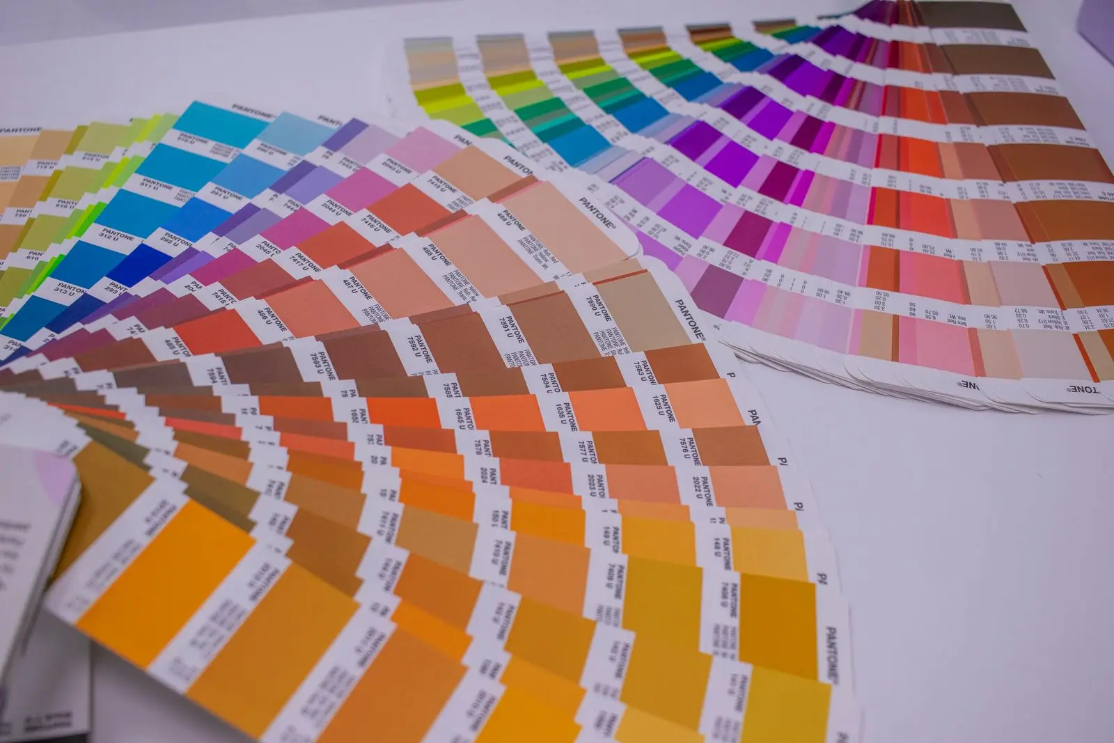
Product images for a print catalog usually fail before they reach the press. The photo looks sharp on your monitor, the layout looks fine in the PDF, and then the printed sheet comes back with a dull orange, a soft edge, or a white sliver at the trim. None of those are photography problems. They are file problems, and every one of them is cheaper to fix on your laptop than on a press run.
This is the working checklist for an export supplier putting a product catalog, a price list or a spec-sheet pack together for buyers. It covers the pixel math, the colour conversion, the bleed, the ink limit and the export settings that decide whether the printer accepts your product images for a print catalog run — or sends the whole file back.
What "print-ready" means for product images for a print catalog
Print-ready product images are image files whose pixel count, colour space, ink limit and edge geometry match the printer's press and page size — not files that merely look sharp in a browser.
There are two failures that cost real money. The first is a rejected file, which delays the catalog. The second is worse: a file the printer accepts, prints badly, and you only discover after 2,000 copies are bound. The checks below are ordered to catch the second kind.
People say "300 dpi" when they mean 300 ppi at the final placed size. DPI is how many ink dots a press lays down per inch; PPI is how many image pixels you supply per inch of paper. Your printer controls DPI. You control PPI. When a printer asks for 300 dpi, they are asking you for 300 ppi, and the "at final size" part is the one everybody skips.
Step 1: Fix the printed size before you touch the pixels
A photo has no resolution until you decide how wide it prints. The same 4,000-pixel file is 338 ppi at 300 mm wide and 169 ppi at 600 mm wide. That is why "is this image high enough resolution?" cannot be answered without the layout.
The formula is simple: pixels needed = printed width in mm ÷ 25.4 × 300. Work backwards from the page. If the printed piece is closer to a spec-sheet pack than a picture book, the page architecture in a spec sheet template for export suppliers decides the widths before any photo is placed.
| Where the photo sits |
Printed width |
Pixels needed at 300 ppi |
What 150 ppi would give you |
| Quarter page, 3-up |
60 mm (2.36 in) |
709 px |
354 px |
| Half page |
105 mm (4.13 in) |
1,240 px |
620 px |
| Full A4 width (210 mm) |
210 mm (8.27 in) |
2,480 px |
1,240 px |
| Full A4 height, rotated |
297 mm (11.69 in) |
3,508 px |
1,754 px |
| A4 spread, full bleed |
420 mm (16.54 in) |
4,961 px |
2,480 px |
Two practical consequences.
First, a phone photo is often enough for a quarter-page shot and not enough for a spread. A 12 MP camera gives roughly 4,000 × 3,000 pixels. At 300 ppi that is 338 mm wide — fine for a full A4 page, not fine for a double-page hero.
Second, do not upscale to hit the number. Interpolation adds pixels, not detail. If a shot is 1,100 px wide and the slot needs 2,480 px, reshoot or move the product to a smaller slot. A 150 ppi image that is genuinely 150 ppi looks better than a 300 ppi file that was invented by software.
If you are unsure how your current files compare, the difference between screen and print resolution is worked through in 300 dpi vs 72 dpi product images.
Step 2: Convert to CMYK with the printer's profile, not a generic one
Screens mix light; presses mix ink. An RGB file describes colours as light, a CMYK file describes them as percentages of cyan, magenta, yellow and black. Converting between them is not a button — it is a calculation, and the calculation depends on which press, which paper and which ink set the printer uses.
That is what an ICC profile encodes. The International Color Consortium's own explanation of profiles is the cleanest one: a profile describes how a specific device interprets colour values, so the conversion can preserve the intended appearance rather than just swapping numbers. Ask the printer for the output condition they run — common European offset conditions are PSO Coated v3 (FOGRA51) for coated stock and PSO Uncoated v3 (FOGRA52) for uncoated — and convert to that profile once, deliberately.
|
RGB |
CMYK |
| Built for |
Screens, cameras, web |
Offset, digital and wide-format presses |
| How colour is made |
Additive light (red, green, blue) |
Subtractive ink (cyan, magenta, yellow, black) |
| Typical catalogue problem |
Neon greens and saturated oranges that cannot be printed |
Muddy shadows and grey-looking blacks from a lazy conversion |
| What to keep |
The original camera file, untouched |
The converted copy for print |
Three rules prevent most colour disasters:
- Keep the RGB master. Never overwrite the original with the CMYK version. You will need the RGB file for the web listing, the WhatsApp catalog and next year's reprint on a different press.
- Convert once, with the profile embedded. Each round trip loses saturated colour.
- Do not let the export dialog choose "no profile". That is a guess, and the printer's software will guess differently.
The colours that shift most are the ones buyers notice on furniture and industrial products: deep reds, bright oranges, saturated greens and clean blues. Soft-proof the converted file on a calibrated monitor before you approve it. If a brand colour must match exactly, treat it as a spot colour and let the printer handle it, rather than trying to hit it with four-colour process.
Step 3: Keep dimension labels and callouts as vector
The product photo is raster. The dimension arrows, the "1,200 mm" label, the part-number callout and the page furniture should not be. Keep them as live text and vector lines in the layout file so they stay sharp at any output size.
A dimension line that was drawn in a photo editor, then scaled to fit the page, prints with soft ends and a fuzzy number. A vector arrow and a text label print cleanly because the RIP renders them from geometry, not pixels.
For measured product images, there is a second reason to keep labels separate: the number has to be traceable to a real measurement, not typed to fit the space. A dimension label belongs on the photo because the buyer needs to see what it refers to; it belongs in vector because the press needs a clean edge. That combination — measured label placed on the real photo, exported at the catalog's output size — is the specific capability worth asking your image workflow for. The measurement is the fact; the label is only the presentation.
If the catalog mixes dimension drawings and photos, the difference between the two formats is covered in dimension drawing for a product catalog.
Step 4: Build the bleed into the page, not into the product
Bleed is the extra image or background that extends past the trim line, so a 1 mm cutting drift does not leave a white hairline at the page edge. The industry default is 3 mm on every side in Europe and 0.125 in (1/8 in) in the US, but your printer's template wins — some digital presses want 2 mm, some large-format jobs want 5 mm.
The mistake is applying bleed logic to the product. The product should sit inside the safe margin, fully visible, with its dimension labels inside the safe area too. Only the background or the lifestyle scene bleeds off the page. A sofa whose arm is cut by the trim looks like a printing error, not a design choice.
| Element |
Where it belongs |
| Background / lifestyle scene |
Extends 3 mm (or printer's spec) past trim |
| Product outline |
Inside the safe margin, not touching trim |
| Dimension labels and callouts |
Inside the safe margin, at least 5 mm from trim |
| Page numbers, logos, legal line |
Inside the safe margin |
Step 5: Check total ink coverage before the printer does
Four inks can add up to more than the paper can absorb. Total ink coverage (also called total area coverage) is the sum of the C, M, Y and K percentages in the darkest part of an image. On coated stock, many presses cap it around 300%; uncoated stock often needs a lower cap because the paper absorbs more.
This is not abstract. The European Color Initiative publishes a separate ISO Coated v2 300% profile precisely for presses that cannot take more than 300% total ink. That file exists because a normal CMYK conversion can produce shadow areas well above the cap, and those areas set off drying, scuffing and offsetting problems.
Two checks:
- Shadow areas and dark product finishes. Black metal, dark wood, dark fabric and deep shadows are where the numbers climb. Ask the printer for their cap and convert with a profile that respects it, or pull the black point down slightly.
- Rich black versus 100K text. Large solid black areas usually print better as a rich black build; small text usually prints better as 100% K only, because four-colour registration on tiny type produces coloured fringes. A common rich-black starting point is roughly 60C/40M/40Y/100K — but treat any recipe as a starting point, not a law, and let the printer's profile decide the final numbers.
Step 6: Export once, as PDF/X-4, and preflight the result
PDF/X-4 is the exchange standard built for exactly this job: it carries an output intent, embedded ICC profiles and live transparency, so the printer knows what the file is supposed to look like. The Ghent Workgroup builds its print specifications on the PDF/X family, which is a useful signal that this is the format commercial printers actually preflight.
Export settings that matter:
- PDF/X-4 preset, not "high quality print" and hope.
- Output intent embedded — the printer's ICC profile, named in the file.
- Images downsampled only above 300 ppi, never below.
- Fonts embedded, or text converted to outlines only as a last resort.
- Trim, bleed and safe-area boxes set to the printer's template.
- No RGB objects left in the file unless the printer explicitly asks for them.
Then preflight. Acrobat, PitStop or the printer's own preflight will flag low-resolution images, missing bleed, RGB objects and ink over the limit. Fix the source file and re-export — do not patch the PDF by hand.
The print catalog image checklist
Run this before the file leaves your desk.
What to send the printer besides the PDF
A clean PDF is the minimum. Add three things and the print-catalog job moves faster:
- A page-by-page image log — file name, product code, printed width, pixel dimensions and effective ppi. When a question comes back at 4 p.m. on a Friday, this answers it without opening the layout file.
- A colour note — which output profile you used, and which brand colours are spot colours. Do not make the printer infer it.
- A single low-resolution contact sheet of every page. Printers use it to check page order and missing images before they open the press file.
Keep the log with the source files. Next season's catalog reuses most of the images, and the log is what stops someone re-exporting a 150 ppi file as the new cover.
FAQ
What resolution should product images be for a printed catalog?
300 ppi at the final placed size. A 210 mm-wide image needs 2,480 pixels across; a 420 mm spread needs 4,961. Below roughly 150 ppi, the shortfall becomes visible in print, especially on glossy stock.
Should catalog product photos be CMYK or RGB?
Deliver CMYK converted with the printer's output profile, and keep the RGB original. Converting to CMYK without a named profile is not a conversion — it hands the colour decision to whatever software opens the file next.
How much bleed does a print catalog need?
Use your printer's template. Three millimetres per side is the European default and 0.125 in the US default, but digital and large-format presses vary. The bleed applies to the background, not to the product or its labels.
Why do my product photos look dull or dark after printing?
Two mechanisms: the CMYK gamut is smaller than RGB, so saturated colours are compressed, and the ink limit squeezes dark shadows. Soft-proofing the converted file shows most of the loss before the press run.
Can I use the same image file for the web listing and the printed catalog?
No. The web version needs sRGB and a modest pixel count; the print version needs the printer's CMYK profile and enough pixels for the placed size. Export both from the same RGB master and archive all three.
Sources & References