
How to photograph building materials is not really a lighting question. It is a sampling question. Tile, stone, timber and panel products vary from piece to piece by design, and the standard studio instinct — pick the best-looking piece, light it beautifully, ship it — produces an image that the delivered pallet can never match. That gap is where the claim emails come from.
Everything below answers one practical brief: how to photograph building materials so the image the buyer approves and the pallet the buyer receives are the same product. Six questions decide it.
Why does the material look different in the photo than in the box?
Because you photographed one piece and they opened a run.
Shade variation is the rated, expected difference in color and texture between pieces of the same product, and for ceramic tile it is a classified property, not an accident. ANSI A137.1, published by the Tile Council of North America, assigns every tile an aesthetic class from V0 to V4: V0 shows no shade range detectable by the average eye, V1 is uniform appearance, V2 slight variation, V3 moderate variation, and V4 is substantial variation where one piece may show completely different color and texture from the next.
A V4 product photographed as a single piece is a misrepresentation even when nothing was retouched. The industry's own guidance for V3 and V4 material is that the range should be viewed before selection and a mock layout made — which tells you exactly what your photograph needs to be.
Natural stone has the same problem without the classification. The Natural Stone Institute's position is blunt: pits, fissures, veining and tonal shifts are inherent characteristics, not defects. Two slabs from one block differ. A 100 × 100 mm sample chip was selected because it looked good.
Which piece do you shoot when every piece is different?
Shoot the range, not the winner.
The working method for any product rated V2 and above:
- Pull pieces from at least three different boxes or bundles, ideally from more than one production lot.
- Lay 6 to 12 pieces in a grid, dry, no grout, in the orientation the buyer will install them.
- Shoot that grid flat and square as the primary catalog image.
- Shoot one single piece separately as a secondary image, and label it as one piece.
Buyers who work with variable materials read a grid image instantly and trust it. A single hero piece reads as a sample, and experienced buyers discount it automatically — which means your best-looking product photo is doing less work than a plain honest one.
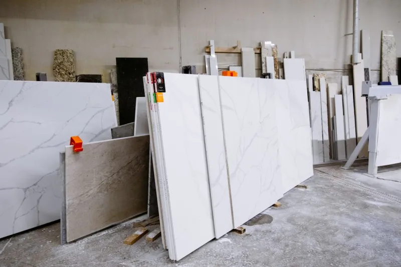
For slabs, the equivalent rule is: photograph the whole slab, upright, straight on, with the full sheet in frame. A cropped detail of the prettiest veining tells the buyer nothing about the 3-metre piece they are buying, and cropping is exactly what a claim will be about later.
How do you photograph gloss without lying about it?
You mostly don't. You measure it and put the number on the image.
Gloss is a measured quantity, not a look. ASTM D523 defines specular gloss measurement at 60°, 20° and 85° geometries, reported in gloss units on a scale where a polished black glass reference reads 100 GU at the specified angle. The 60° geometry is the general-purpose one; 20° is used for high-gloss surfaces above roughly 70 GU, and 85° for low-gloss surfaces below roughly 10 GU.
Why this matters for photography: the bright highlight running across a polished tile in your image is a property of your softbox, not of the material. Move the light and the "gloss" changes. So a photograph can never settle a matte-versus-satin argument, and buyers who have been burned know it.
Practical rules:
- Publish the 60° GU value in the spec block next to the image. It ends the argument in one number.
- Shoot matte and polished finishes of the same product under identical lighting, and present them side by side. Relative comparison survives; absolute impression does not.
- Never shoot a polished surface with a single hard source. You are photographing a mirror; light the room, not the tile.
- Colour management is a separate, solvable problem — the places colour actually breaks are covered in product photo color accuracy.
How do you show size when the material has no obvious scale?
With a dimension line on the piece, not a coin next to it.
A close-up of stone or timber has no inherent scale. Grain, veining and texture look the same at 200 mm as at 2,000 mm, so the buyer has no way to judge unless you tell them. Props help a little and look amateurish in a B2B catalog; a measured dimension drawn onto the image helps a lot and reads as professional.
The size you print also has to be the right one. ISO 13006 and EN 14411 distinguish nominal size (the size the product is sold as, e.g. 30 × 60 cm), work size (the size the manufacturer makes it to, which the actual size is checked against), and actual size (what a given piece measures). Manufacturers commonly ship a nominal 30 × 60 cm tile in calibres such as W1 at 29.8 × 59.8 cm, W2 at 29.9 × 59.9 cm and W3 at 30.0 × 60.0 cm.
Two consequences that cause real disputes:
- If your image says "30 × 60" and the delivered calibre is 29.8 × 59.8, an inexperienced buyer thinks you shipped the wrong product. State nominal size and calibre.
- Mixing calibres in one order is a genuine installation failure, not a cosmetic one. Say on the image whether one shipment is single-calibre.
Reference sizes by product type are on the standard tile sizes page, and the edge-finishing difference that drives half of these size arguments is unpacked in rectified vs non-rectified tile.
What lighting angle shows texture, and which one kills it?
Low and raking shows it. Flat and frontal kills it.
Light arriving at a shallow angle across the surface — grazing or raking light — casts small shadows in every depression, and that shadow pattern is what the eye reads as texture. Light arriving straight down the lens axis fills those shadows and flattens a heavily structured porcelain into something that looks like printed paper.
The catch is that raking light also exaggerates. A 0.3 mm surface structure lit at 10 degrees can look like a 3 mm relief. So use both, deliberately:
| Shot | Light angle | What it is for | Risk if used alone |
|---|---|---|---|
| Catalog primary | Broad, slightly off-axis | Honest colour and pattern | Texture reads as flat |
| Texture detail | Raking, 10–25° across surface | Proving surface structure exists | Overstates relief depth |
| Finish comparison | Identical for both finishes | Matte vs polished, same product | Meaningless if lighting differs |
| Installed context | Ambient / architectural | Scale and joint appearance | Hides individual piece detail |
Label the texture detail as a detail shot. A buyer who orders a "deeply textured" slate from a raking-light close-up and receives something subtler will not accept "that is how photography works" as an answer.
How many images does one building-material SKU actually need?
Six, and they are not interchangeable.
| # | Image | Must show |
|---|---|---|
| 1 | Range layout | 6–12 pieces from ≥3 boxes, dry-laid, square to camera |
| 2 | Single piece, flat | Face pattern, true colour, no crop |
| 3 | Dimension / spec image | Nominal size, calibre, thickness, weight per m², pieces per box |
| 4 | Texture detail | Raking light, labelled as detail |
| 5 | Edge and back | Thickness, rectified or pressed edge, backing mesh, mounting |
| 6 | Installed context | Joint width, layout pattern, realistic scale |
Number 3 is the one most exporters skip, and it is the one that removes the most pre-sale questions. A layout that works for the whole range is described in the building material spec diagram guide.
How to photograph building materials: quick-reference summary
| The question | The number or rule that settles it | What goes on the image |
|---|---|---|
| Piece-to-piece difference | ANSI A137.1 class V0–V4 | The V rating, and a multi-piece layout |
| Which piece to shoot | ≥3 boxes, 6–12 pieces | "Representative range, N pieces, M lots" |
| Gloss level | ASTM D523, 60° geometry, gloss units | The GU value in the spec block |
| Size | ISO 13006 / EN 14411 nominal vs work vs actual | Nominal size + calibre |
| Texture depth | Raking light 10–25°, labelled | "Detail, raking light" |
| Scale | Dimension line on the piece | Length, width, thickness in mm |
The one-line version: photograph the range, not the winner — the buyer's pallet is an average and your hero shot is an outlier.
Pre-shoot checklist for a building-material SKU
- Shade variation class known and written down before the shoot
- Pieces pulled from at least three boxes, lot numbers recorded
- Grid layout shot square to the camera, no keystone
- Same lighting setup used for every finish of the same product
- 60° gloss value obtained from the factory and recorded
- Nominal size, calibre, thickness and weight per m² confirmed against the spec sheet, not the sales sheet
- Texture detail shot labelled as a detail
- Edge and back photographed for anything rectified, mesh-mounted or profiled
- Dimension image produced with measured values, not estimated ones
- Image set exported at the size each destination requires before it is sent to anyone
FAQ
Why does my tile photo look more yellow than the actual tile?
Almost always mixed light temperature — daylight through a window plus a tungsten or LED source — or an auto white balance that used a colour-cast surface as its reference. Shoot a grey reference in the first frame of every setup and correct from it, and never mix source temperatures in one shot.
Do I need a professional photographer for building materials?
For five of the six shots, no. A tripod, one large diffused source, and a grey card get you there. The one you cannot improvise is the dimension and spec image, because it depends on accuracy rather than on craft: the numbers have to be the measured ones, they have to sit on the piece they describe, and they have to survive being resized for a marketplace listing and a printed catalog. Drawing arrows by hand in a general photo editor breaks on the first resize, and an AI image generator will invent a plausible-looking measurement rather than reproduce the real one, which in a spec context is worse than leaving it blank. What works is software that snaps a dimension line to the true edge of the piece in the photograph, locks the measured value to it, and exports the same annotated image at every size you need.
How do I photograph a stone slab that is three metres long?
Upright, straight on, whole slab in frame, from far enough back that the lens is not stretching the ends. Use a longer focal length and step back rather than a wide angle up close. Then shoot detail crops separately and label them as crops. A slab image that has been stitched or perspective-corrected should be marked as such, because veining position is part of what the customer is buying.
Should I edit out pits and fissures in natural stone?
No. The Natural Stone Institute treats them as inherent characteristics of the material rather than defects, and removing them creates a documented expectation you cannot deliver against. Photograph them and describe them in the caption. Buyers who understand stone read their absence as retouching, which costs you more credibility than the pits ever would.
What resolution should the images be?
High enough that the destination's zoom viewer turns on. When people ask how to photograph building materials for marketplaces specifically, this is the part that differs by platform: shoot once at the highest quality you can hold, then export per destination. Keep the resolution, and identical across the SKU set so the range layout and the detail shots look like one family. Fix the export size per destination once and apply it to every image, rather than deciding per photo.
Sources & References
- ANSI A137.1-2022 American National Standard Specifications for Ceramic Tile — Tile Council of North America
- How to Prepare for Tile Shade Variation — Ceramic Tile Education Foundation
- ASTM D523 — Standard Test Method for Specular Gloss
- Understanding Gloss Standards and Units — Konica Minolta Sensing
- ISO 13006:2018 — Ceramic tiles: definitions, classification, characteristics and marking
- What is tile work size? Manufacturing dimensions explained — Refin Ceramiche
- Natural Stone Institute